Today's CPAN experiment was 15 minutes with Chart::Clicker. I'd heard great things about this distribution before, but had never tried it.
I've been working lately on financial analysis of publicly traded companies. In particular, I've been analyzing trends in the growth of owner earnings, given a ten year window of SEC reports. (Don't worry if you don't know everything that means yet.) The goal of this work is to find a trendline which smooths out yearly ups and downs and gives a good idea of the company's expected growth.
(That number is particularly important if you want to project the intrinsic value of a company into the future to decide the value of an individual share of that company right now. This is very standard Graham/Dodd/Buffett stuff, but it's also specific domain knowledge interesting only to this post as background information.)
My statistics are a bit rusty, so I wanted to see the resulting information before I trusted my calculations. My first instinct was to copy and paste information into a spreadsheet and create a graph there. Yes, I did that manually a couple of times. Then I remembered I have the full power of Perl available.
Chart::Clicker installed easily. Its documentation is a bit on the thin side, if you need to customize things (and I did), but if you poke around at the various components and their methods, you can make sense of things. (In particular, I wanted to change the underlying grid lines to correspond with the data points on the X axis. They're years, after all.)
My analysis code produces a list of values for free cash flow in thousands of dollars over a ten year range. It also uses the least square fit technique to plot a line representing the change in those values. That line should show the trend in values with as much accuracy as possible. While I have ten points for the free cash flow line, I need only two points for the trend line, because it's a straight line.
Chart::Clicker makes it really easy to add two datasets with different numbers of points. (I'm fortunate that the first and last X coordinates are the same.) Here's the code:
use Chart::Clicker;
use Chart::Clicker::Data::Series;
use Chart::Clicker::Data::DataSet;

my $chart = Chart::Clicker->new;

my $fcf_line = Chart::Clicker::Data::Series->new(
    keys   => [ 0 .. $#{ $fcf_values } ],
    values => $fcf_values,
    name   => 'Free Cash Flow (thousands)',
);

my $trend_line = Chart::Clicker::Data::Series->new(
    keys   => [ 0, $#{ $fcf_values } ],
    values => [ $first_y, $last_y ],
    name   => 'Free Cash Flow trendline',
);
my $dataset = Chart::Clicker::Data::DataSet->new(
    series => [ $fcf_line, $trend_line ],
);

$chart->add_to_datasets( $dataset );
my $context = $chart->get_context('default');
$context->range_axis->format('$%.0f');
$context->domain_axis->hidden(1);
$context->domain_axis->ticks( $#{ $fcf_values } );
$chart->write_output( "${symbol}.png" );
A chart contains one or more datasets, and a dataset contains one or more series. Each series corresponds to a line. Populating a series is easy, given arrays of data; keys represents the X axis and values represents the Y axis.
Most of the rest of my code customizes the display of the data. I haven't
found the right way to display the X axis yet, so I've elided that for now. I
also had to customize the underlying graph lines, as mentioned before. That
customization was the only tricky part of using Chart::Clicker,
and that only because it took a few minutes to figure out how to do it.
The results are attractive. Here's a chart showing the earnings for Coca-Cola (NYSE:KO) over the past decade:
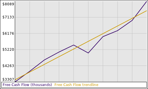
Figure 1. Free Cash Flow and Trendline for NYSE:KO.
Chart::Clicker is fast, too. I added this to my analysis step
for the 30 stocks in the Dow Jones Industrial Average, and I can't measure the
increase in time required to create these images. (This analysis step has
network IO as its bottleneck.)
I'm not often wholly impressed by Perl and the CPAN anymore; I expect things to work. I didn't expect things to work as easily as they did today. The whole experiment demonstrates the best the CPAN has to offer.
